
BELLA COLLINA WEDDING: LUXURIOUS WHITE AND GOLD WEDDING STATIONERY
Tabitha and Richard’s wedding at The Club at Bella Collina just outside of Orlando, Florida was such a dream and featured white and gold throughout the entire day. Their day-of wedding stationery carried their light and airy theme through their signage, place settings and dance floor. Read on to learn how we worked with this couple all the way from Arizona to create cohesive wedding day stationery.
The Club at Bella Collina is an absolutely stunning venue just outside of Orlando. When I lived in Orlando and was interning with a wedding planner, I coordinated a few weddings there. It’s probably one of the first venues I fell in love with and made me want to continue on in the wedding industry. It is just so elegant and beautiful!
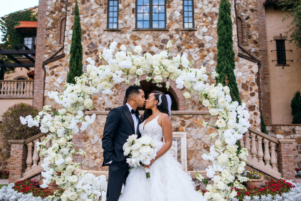
BELLA COLLINA WEDDING DAY DETAILS & CEREMONY
About a month before the wedding Anna Christine Events reached out to me to see if I was available for day-of wedding stationery for an upcoming wedding- in Florida. If you didn’t know, I’m located in Arizona but am able to of course send my stationery anywhere! I had the availability to fit the wedding in – even though I was about 32 weeks pregnant at the time, more on that to come…
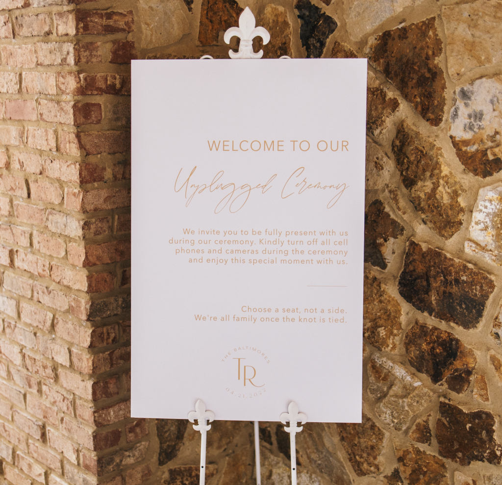
The bride, Tabitha, and I set up a zoom meeting and got to designing during her first consultation. She told me she envisioned all white and gold throughout the wedding, absolutely zero black- even the text couldn’t be black. So we opted for her text to be a gold toner on a white background for an ultra clean and modern look.
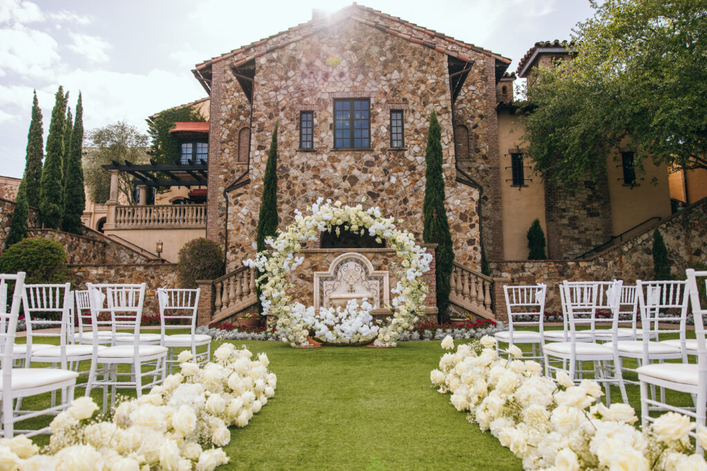
BELLA COLLINA WEDDING – CEREMONY GRAND LAWN
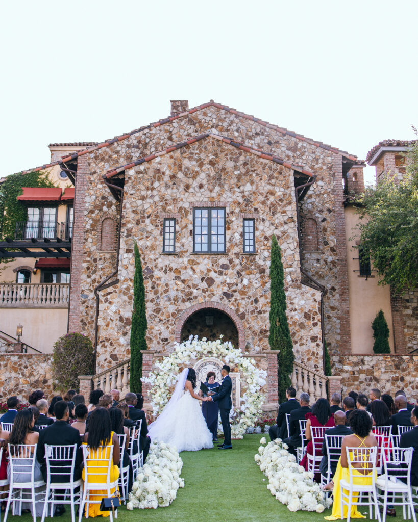
The couple exchanged their vows on Bella Collina’s Grand Lawn. The floral’s were white and fully bloomed. The floral circle arch against the tuscan styled venue made the perfect ceremony backdrop.
It was important to the couple that they had an “unplugged ceremony” sign for their guests. This lets their guests know that they need to silence or turn off their cell phones and to not take photos. A great way to ensure your photographer doesn’t have guests taking photos within their photos.
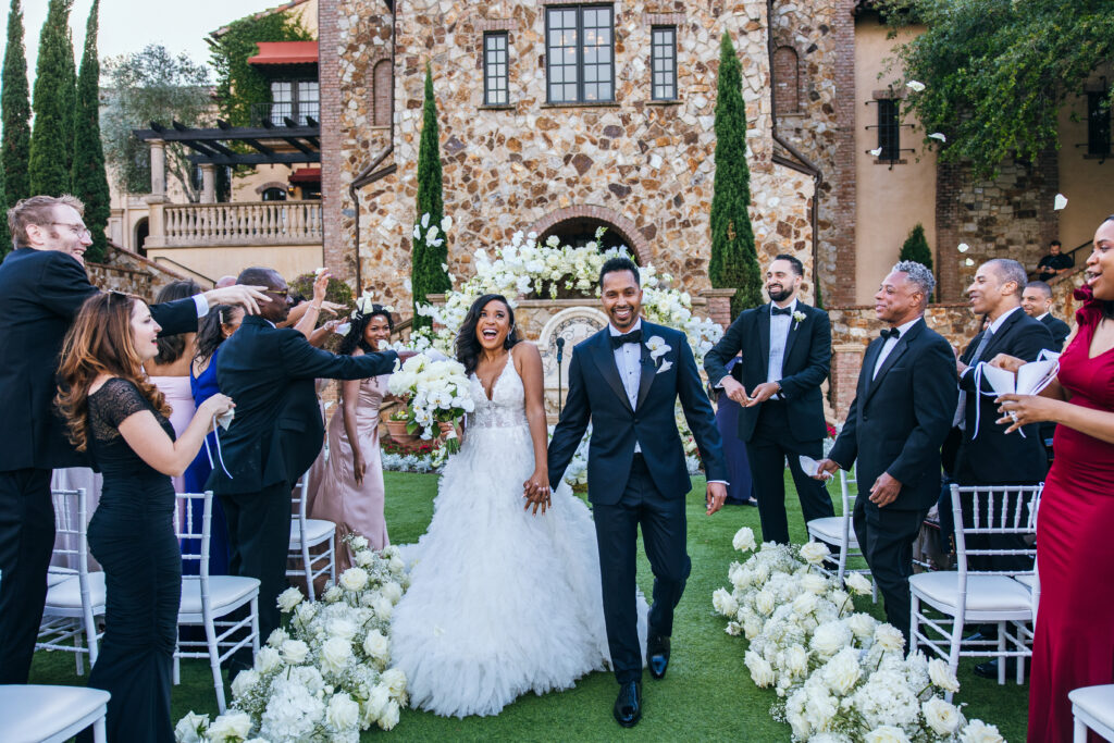
BELLA COLLINA CLUB WEDDING – RECEPTION & DETAILS
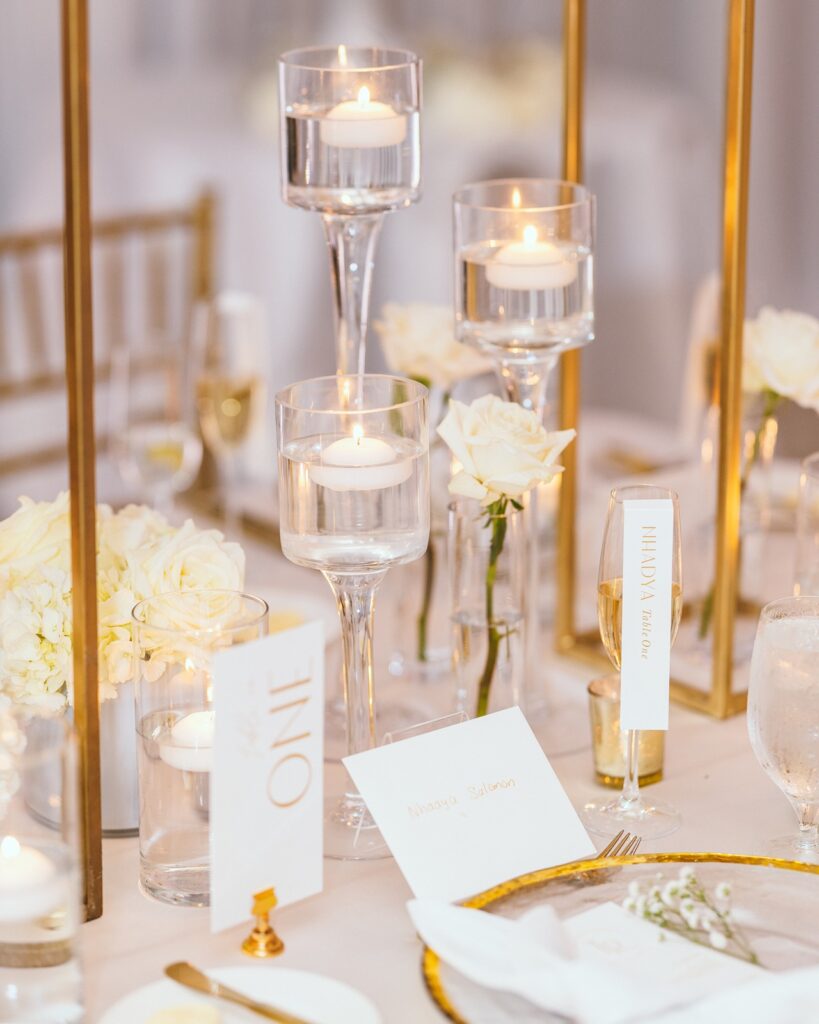
For the seating arrangements, Tabitha told me that she envisioned a champagne escort card display. This was my first time doing one so it was super exciting for me!
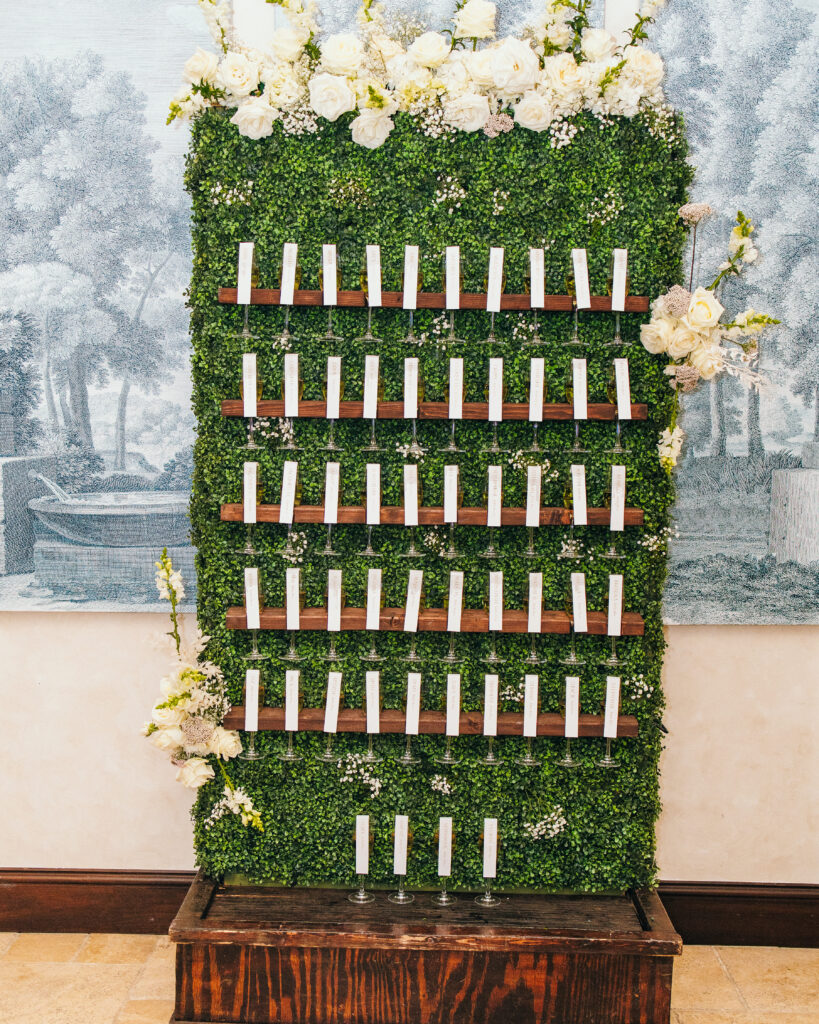
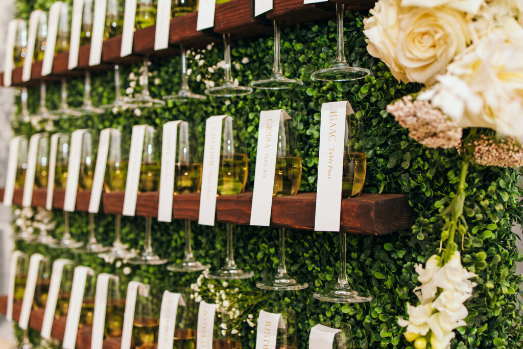
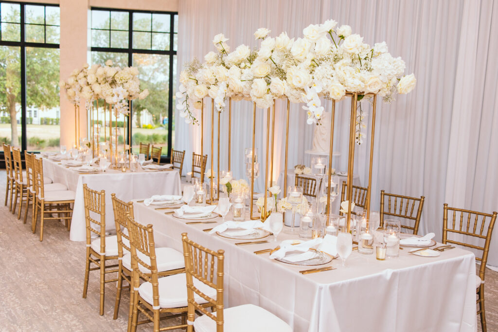
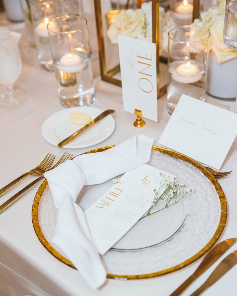
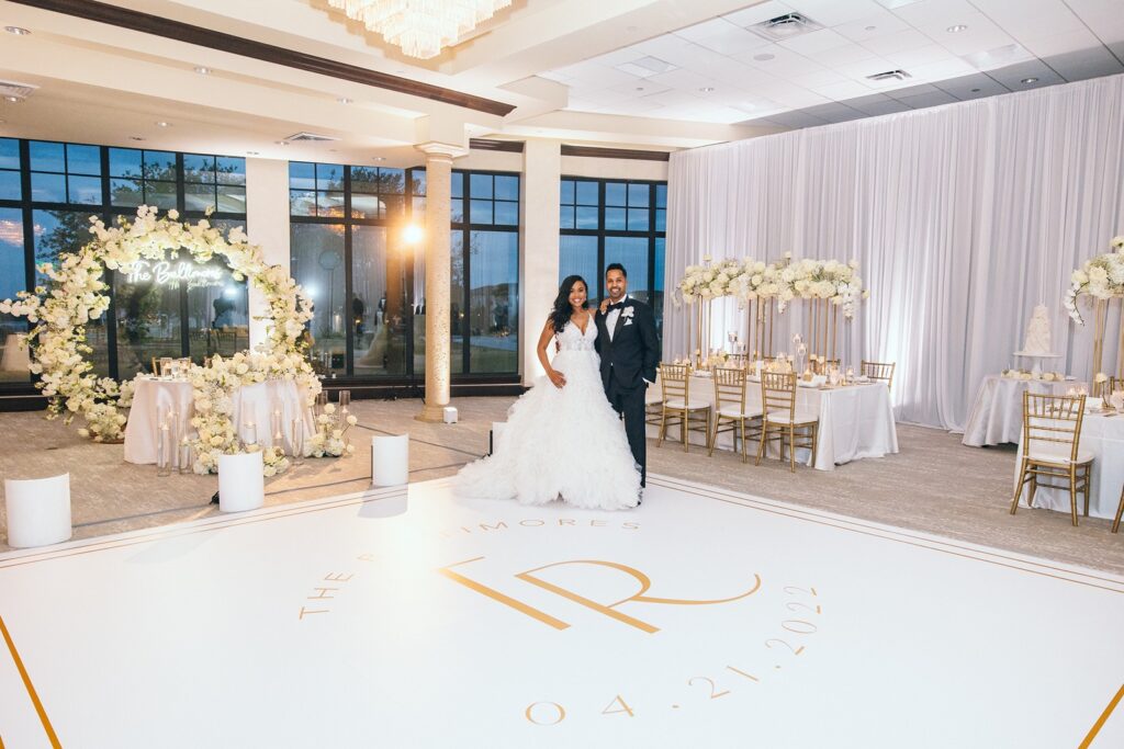
The ballroom was lined with white pipe and drape to elevate the luxurious experience for their guests. Tall gold and white floral centerpieces lined the rectangle reception tables. For the table numbers and menus, we used the same font and color scheme as the ceremony unplugged sign. Clean, modern and simple. A perfect touch for their tables.
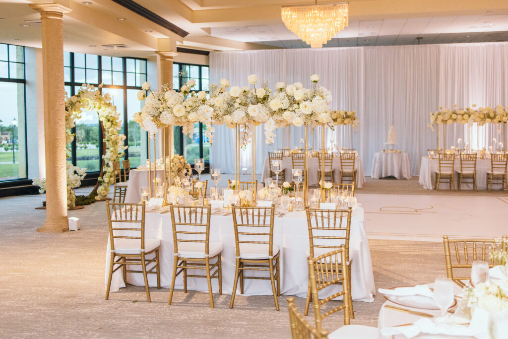
The bride and groom wanted to have a bar sign available to display their signature drink and the items available at the bar. We kept the same font and vibe as the rest of the pieces but turned the header “drinks” to be along the side of the sign, just like the menus to tie in a fun modern element.
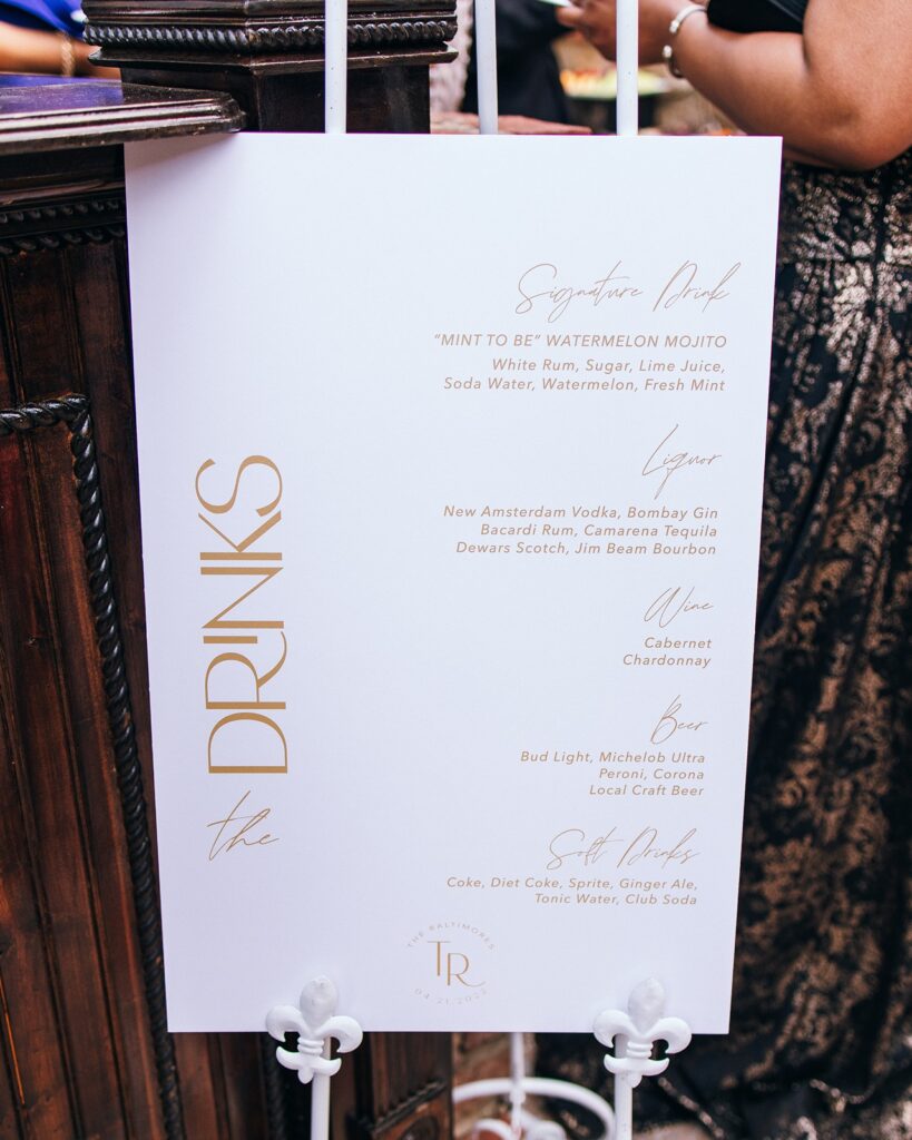
I created an initial monogram, otherwise known as a “duogram,” for their wedding stationery. It can be seen in several places such as the menus, ceremony sign and bar sign.
But my favorite place we displayed it was right in the middle of their reception- the dance floor. I sent the file over to their production team and they were able to create a large scale decal to be placed on the dance floor. I think it turned out pretty awesome!
BABY LABOR + A RUSH WEDDING
Quick little story about the timing of this wedding! So I took the wedding on about 6-8 weeks before the wedding, which is pretty normal for “day-of” only stationery. I thought I was good on the timing because I was about 33 weeks pregnant and was due roughly around the time of their wedding date, which was perfect because all of their items would have been completed about a 1-2 weeks before their date and my delivery date.
Well, 3 weeks into designing and working with Tabitha, my water broke unexpectedly- almost a month early! It was a slow labor over the first 6 hours and I was so worried about finishing the design for their upcoming wedding that I literally had my laptop in the triage room and was working on their design and final round of proofs in between contractions! I went into pre-labor and had our sweet, Savvy girl way early! (All went well with the birth, thankfully!)
Being in the hospital with a premie for a couple days I couldn’t print everything on my own so I seeked help from another stationer to print all of Tabitha and Richard’s day-of items. I have to thank Lisa, at The Invitorium for stepping in and completely RESCUING me from so much added stress while I was in the hospital. Lisa and her team took my designs and sent them to print and finished all the scoring of the escort cards and made sure the paper was perfect. All turned out so dreamy and beautiful!
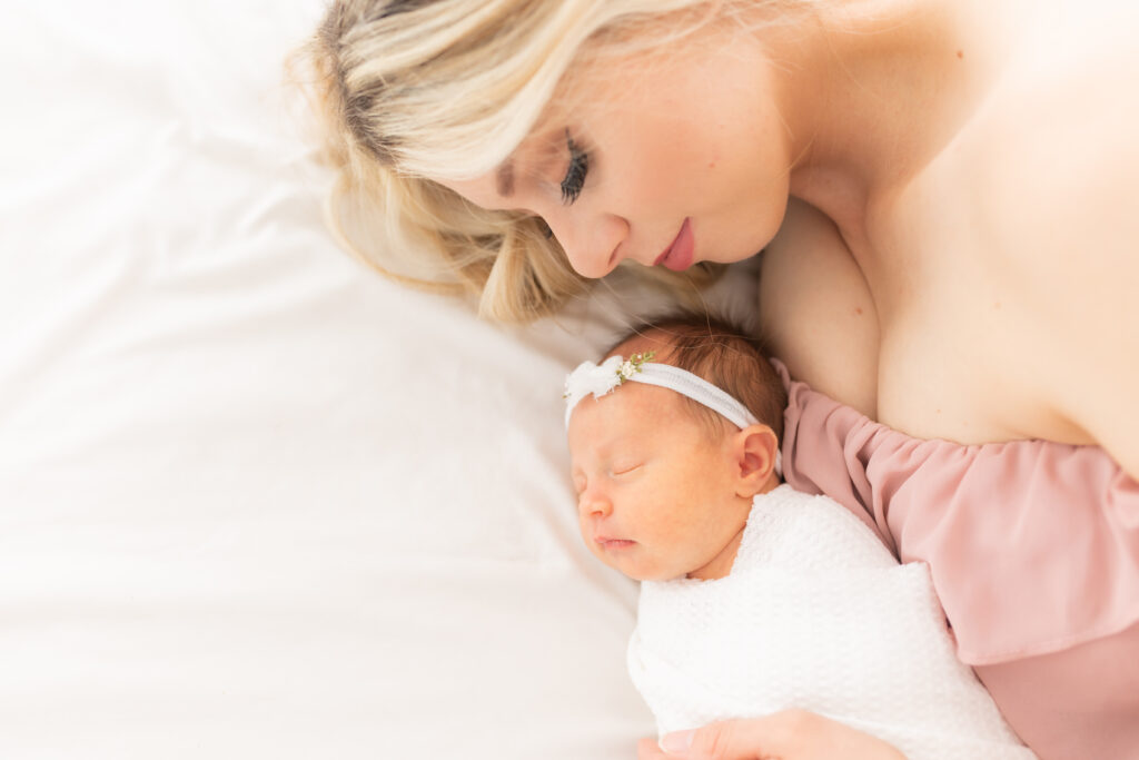
Photo of myself with our newborn. Photo by: Nichole Pach Photography
Looking for a way to make your wedding stand out and be more personalized? Customized wedding stationery may be what you need! I design custom wedding stationery goods such as menus, place cards, escort cards, welcome signs, bar signs and more! You can view my day-of wedding page here for more wedding ideas!
Orlando Wedding Vendors
- Venue and catering- Bella Collina
- Photographer- Gerome Ogeris Photography
- Videographer- Chris McClain Productions
- Florist- Fiora Designs Studio
- DJ, Dry Ice, Photo Booth and Up-Lighting- Madd Vybez
- Live Musicians- Classern Quartet
- Cake- Everything Cake
- Effects- Fyerfly
- Rental Items (chairs/specialty furniture/chargers)- A Chair Affair, champagne wall, gold flatware, gold rim chargers, gold Chiavari chairs with white pads
- White pipe and drape- Swag Décor
- Dance Floor Wrap- Letz Dance On It
- Linens- Over The Top
- Specialty Performers/Guest Entertainment- Saxophone with Reggie from RL3 Music
- Hair- Touch of Oshie
- Makeup- Glammed by Tybella
- Paper Goods (signage/day-of papers/dance floor design)- Copper Cactus
- Transportation- Exotic Limo, getaway car
Leave a Reply
NEXT POST
PREVIOUS POST
About Christina Lei
Wedding stationer
As a wedding stationer, I'm passionate about collaborating closely with couples to create bespoke designs that reflect their unique vision. I enjoy crafting stationery that tells their love story and offers guests a preview of the celebration to come. Personalized, one-on-one consultations are an integral and valued part of my process.
More About me
Explore
Recent Posts
Ready to work together?
I'm thrilled you're considering me for your wedding invitations! These aren't just announcements; they're the first glimpse of your love story and a treasured heirloom for generations to come. Let me help you craft this unforgettable first impression.
contact us
Leave a Comment